
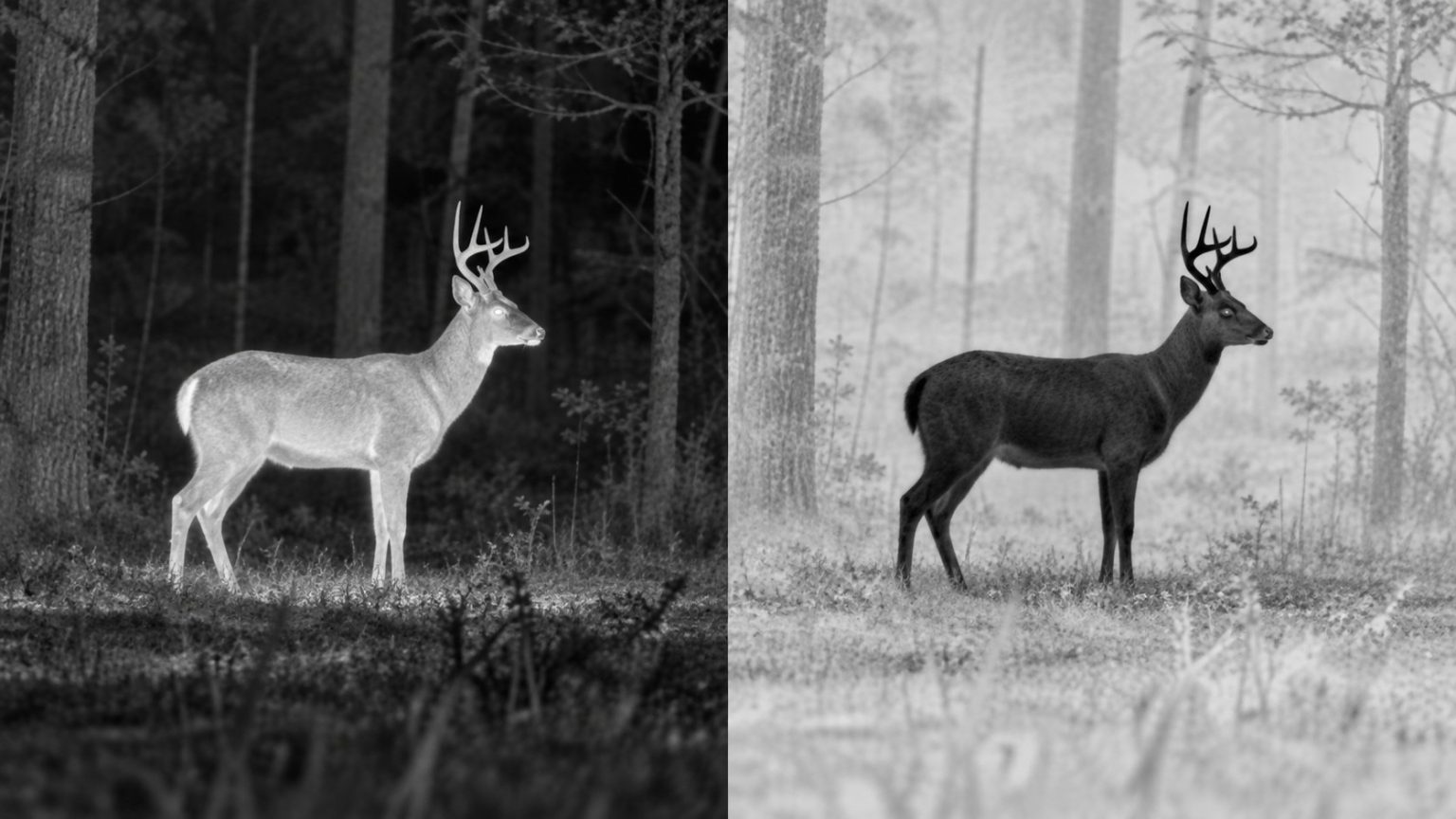
The main difference in white hot vs black hot is the way the same thermal information is displayed. White hot maps relatively warmer-looking parts of the scene toward white; black hot reverses that grayscale presentation. Switching between them can change how easily you notice a shape, but it does not change the detector’s native resolution or remove an obstruction.
Neither palette is universally best for birds, coyotes or every background. A useful choice is the one that helps you inspect the subject and its surroundings consistently, with the device focused and the display set comfortably.
What the two palettes show
In a simple grayscale view, white hot uses brighter tones for the warmer end of the displayed thermal signal and darker tones for the cooler end. Black hot reverses that relationship.
FLIR’s guide to outdoor thermal palettes describes both options. The central point for an observer is that these are ways of presenting infrared information, rather than the true visible colors of the animal or landscape.
This simplified illustration shows the relationship. It is not a temperature scale or a prediction of exact pixel values on a particular device.
| Relative level within an example scene | White hot presentation | Black hot presentation |
|---|---|---|
| Higher apparent thermal signal | Lighter | Darker |
| Intermediate signal | Intermediate gray | Intermediate gray |
| Lower apparent thermal signal | Darker | Lighter |
A white bird-shaped patch does not mean the bird has white feathers. A dark patch in black hot does not mean the subject is cold. Read the palette before describing what the image shows.
Why the same shape can look easier in one view
Your task is usually to distinguish an outline, movement or a small exposed area from its surroundings. A reversal of light and dark can make a boundary more noticeable to you, even though the underlying capture has not gained new detail.
For example, imagine a small warm shape among many narrow branches. In one polarity, your attention may keep returning to bright twigs or an open patch of sky. In the other, the animal’s outline may be easier for you to follow. That is a useful observation about that scene and your viewing, not proof that the palette has improved the sensor.
The opposite outcome is equally possible in another background. Avoid turning one memorable sighting into a rule that all birders or hunters should use the same setting.
Focus also matters more than a palette comparison can reveal. If the scene is optically soft, first follow the thermal focusing sequence. Comparing two blurred presentations is an unreliable way to judge either palette.
A practical comparison that keeps the variables separate
Choose a familiar stationary scene containing an identifiable object and useful background structure. Use a subject you can confirm independently rather than starting with an unexplained distant spot.
- Set the eyepiece, objective focus and calibration as required.
- Use the device’s base view or a modest familiar zoom setting.
- Leave brightness, contrast and enhancement unchanged for the first comparison.
- View the same scene in white hot, then black hot.
- Compare the subject’s edge and the surrounding landmarks, not just how dramatic the screen looks.
Ask yourself three practical questions. Can you relocate the subject quickly after lowering the viewer? Can you follow its outline without losing the background? Can you inspect the image comfortably without repeatedly altering the display?
If one setting works well, use it as your normal starting point. A familiar baseline makes later changes easier to assess. There is no obligation to switch continuously simply because both options are available.
Use a second palette as a cross-check
When a shape is ambiguous, a brief reversal can help you notice a feature you overlooked. It is a way to inspect the same evidence differently, not independent confirmation of identity.
Suppose a partially hidden animal looks like a coyote in white hot and still looks like one in black hot. The second view does not reveal anatomy that was behind a branch in the first. You still need the relevant identifying evidence.
Likewise, a stationary patch that resembles a bird in two palettes may still be a misleading surface pattern. Keep track of movement, position and surrounding structure. Our guide to interpreting animals in thermal images explains those limits more fully.
For birding, use the thermal location to obtain suitable confirming evidence, following the approach in how to use a thermal monocular for birding.
Palette, brightness and contrast are different controls
Changing polarity changes which end of the grayscale is light or dark. Display brightness changes how bright the screen appears. Scene contrast or enhancement controls may alter how differences are presented, depending on the manufacturer.
The controls can interact perceptually, so a comfortable brightness in one palette may need a small adjustment in another. For a fair first comparison, hold settings steady; afterward, make the view comfortable for actual use.
Do not assume every model uses the same menu terminology. Read the control descriptions for your device. A setting named brightness may affect presentation differently from a setting with the same name elsewhere.
Excessively aggressive processing can also make an image seem striking without making its interpretation easier. If fine background structure disappears when you raise a slider, note that cost rather than judging only the subject’s immediate visibility.
White does not represent one fixed temperature
On many observation devices, automatic scene mapping changes the displayed range as you pan. A surface can therefore appear lighter or darker after the composition changes, even without a meaningful change in that surface itself.
Do not assign a body temperature from a white or black patch. A temperature measurement requires an appropriate instrument, supported measurement features and the right conditions; a wildlife spotting palette alone does not provide that capability.
For the same reason, avoid comparing brightness across unrelated recordings as though it were a thermometer. Different scenes, settings and processing can produce different presentations.
Our article on thermal monocular NETD explains sensitivity, another specification that is sometimes confused with temperature accuracy. A sensitive detector, an attractive palette and a calibrated measurement are separate concepts.
What about colored palettes?
Some devices provide additional color mappings. FLIR’s explanation of color palettes and isotherms shows why a color may represent either part of a palette or a highlighted range. Names and behavior vary between products, so do not assume that a red highlight always represents the same threshold or function.
Before trusting a color cue, read what the device says it represents. Is it a relative part of the current scene, a user-selected threshold or something else? If you cannot explain the cue, return to a familiar grayscale view for interpretation.
More palette options should not automatically outrank a useful field of view, suitable detector or easy controls. Our thermal resolution guide explains why a colorful display cannot replace captured detail.
Choose consistency over a universal rule
For a product shortlist, start with the best thermal monoculars for birding, the coyote-hunting guide or the budget thermal guide. Check that palette changes are accessible, then give greater weight to the imaging and handling features your outings require.
Choose a familiar default, learn what its tones mean, and use the other polarity when it helps inspect a difficult scene. A palette earns its place by helping you read the information available, not by making an uncertain observation certain.

Elliot Vantage is an optics enthusiast and the editor behind Optic Horizon, covering monoculars, binoculars, thermal optics, and related outdoor gear. He researches manufacturer documentation, optical specifications, product features, pricing, and use-case differences to help readers understand their options and choose equipment that fits their needs.